Howdy!
It's been a great year and if you follow me on
Facebook or
Instagram, you'll see that I unexpectedly met someone wonderful last year (January 2nd), got engaged (May 2nd), and closed the deal with a wedding on March 19 of this year. We just had a wonderful honeymoon in New Zealand, and are super duper happy. Our lives have changed, our families are bigger, and we are on an adventure!
When it comes to 'work', I've been doing a lot of things in film, animation, advertising, writing, illustrating, painting, and more. Last summer I made the tough decision to leave my day job of 6+ years at Moonbot Studios, where I learned a ton and found some great friends. Having been there as the first employee, the head of the art department, and cutting my teeth with Art Direction and Directing, helping us win numerous awards, an Oscar, a NYTimes Bestseller, and all the great projects -- walking away was not easy. But I need to pursue too many things to not be out on my own, for now. The vehicle for this will be
Sweet Cloud.
Sweet Cloud Studios is currently myself and my wife, Mary. We have many friends and connections to contact and contract if we need it, but we are building this venture as a storytelling house, doing all that we love and desire. I'll share more on that soon.
--
ANYWAY - In digging around some hard drives, I found lots of artwork that I haven't shared, and thought I'd start catching up for lost time. Here's the first splash in that effort: A caricature of the character ROGER STERLING from MAD MEN (played by John Slattery).
This was originally done for the International Society of Caricature Artists (ISCA) publication, "Exaggerated Features" about two years ago. I wanted to tackle the idea of doing something quick and simple, to talk about the creative decision-making process more than 'what brush to use' or 'how to exaggerate. It's a little dated, light and cheesy, but it's meant to get into the psychology behind a deadline and the insecurity of artists... I'll just let you read. Forgive how hammy it is, it was optimistic stream of consciousness.
Here ya go!
-
Let's get in our heads. It's GAME DAY!
Creating a caricature from scratch,
digitally, in under and hour, what that means, and what you could
possibly be thinking.
-
Caricature is tough, you all know that.
What makes it so tough (aside from the blatantly obvious artistic
skill requirements and problem solving needs) is the decisiveness of
it all. Making decisions. Decisions are a product of wants, needs,
experience, expectations, and perhaps the most heavy factor, taste.
Along with all these execution
ingredients, there is the EXPERIENCE of the artist. I once heard
someone (unfortunate that I can't remember who, I apologize) relate
that artists don't have a “game day”. It's true. Most don't.
Okay, there's the theme park or party caricaturist who entertains and
can succeed with a diving one-handed leap into the end zone as they
place the huge swoop of an underbite while uncle Phil spits his bear
laughing. And there are those lucky talented few like Dan Dunn and
Stephen Fishwick who draw live in front of the wealthy or a stadium
of fans, slinging paint on a portrait of Elvis for their third
“perfect game” this year. But most of us sit quietly and
contemplate every whim and decision with doubt as we move along our
path towards being 'sort of okay with' what we produce. Even the
rock stars have to do that in order to get to the stadium
paint-flinging thing! I know those punks spend weeks and months
perfecting their process. Not glamorous.
So that's what I'm going to do – I'm
going to walk through my process in creating a digital caricature in
under an hour. This often-called 'speed paint' will be a vehicle for
talking about our decisions, choices, tastes, shortcuts, habits, and
whatever you deem worth reading between the lines and laziness (you
clever Freudian punk).
Let's start. It's late Spring in the
year 2014. I am Joe Bluhm, living in Louisiana and working at an
animation studio. I have not done many caricature illustrations or
portraits in a while, so I'm excited to simply be doing one. But I
have to be excited throughout the process, because as I know from my
years doing editorial illustration, it gets very boring when you are
laboriously rendering an expression, face or personality which BORES
you. So, nothing boring. But what bores me right now? I don't
know.
Not the usual celebrity! Let's start there. Hm. Who
looks interesting. Louis C.K.? He's one of my absolute favorite
filmmakers and comedians... No, I've seen a lot of him done lately.
Ummmm... Donald Draper (Jon Hamm from Mad Men). I just finished
watching the season!
No... I've seen even MORE of him done. I
feel like it's an easy target at this point. Well at least I know
that I'm interested in the content of recent entertainment.
Television and good storytelling is something that's reaching out to
me lately, and I like the idea of the “character” within the
caricature, even if it's subtle, not just a portrait of the subject.
Okay, so I'm into these storytellers or story lines, so who could I
do that would hold my interest? OOH! Roger Sterling! He has
expressions, he is attractive, he is subtle, he has some lines in his
face! I'll look up some photos of the actor John Slattery,
portraying one of the more interesting story arcs on television in
the last decade.
Okay... Lots of great photos on Google. I
could grab a dvd and pause it, but I told myself this is a speed
painting, an exercise. No need to go that far.


Let's choose one. I could pick a dynamic ¾ or profile view – this guy has a GREAT nose and forehead – however his character is looking towards me on the show a lot. It's part of his character on Mad Men, and that's what drew me to him. Hmm... I want him to be recognizable, and I could try a profile, but I feel like his steely little questioning eyes are such a huge part of his character, and I don't want to lose the chance to illustrate that. Okay, I realize it's a bit less risky, and maybe less material for dynamic illustration, but I'm going to choose a front-view of this dude. Some great lighting here anyway. Here's my photo reference choice:

Now I'll keep the other photos up so I
can look at them from time to time, as the nuances and intricacies of
his face are not always obvious, and definitely get lost when staring
at one mid-res photo for an hour.
Okay, ready to go. I've been using
Adobe Photoshop almost non-stop for five years. My job demands it,
and the speed and efficiency of digital is very important to me, so I
am quite comfortable with it. I haven't been painting portraits or
caricatures as much with it, so it's a fun fresh thing, using it for
something that is not what I do day-in and day-out. So, Photoshop it
is, front-view of John Slattery as Roger Sterling, and I'm going to
go ahead and settle now on using a pencil-like brush to sketch, then
a painterly brush to paint. I'll stay in the comfort zone so it's
all about my decisions. Keep it simple, Stupid (that's me).

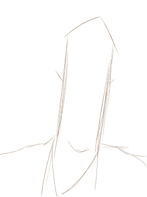
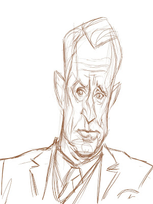
Dude has a tall head. Or a narrow one, at least. So I'm grabbing onto that. From there, I'm finding where the features lay... perhaps higher ears, implying his light head-tilt (I love how he nods his head forward slightly and stares a bit up with a skeptical look at... at who? Who knows... usually Don Draper). So I'll block in the shoulders, hair, ears, eye position, and general proportions of the face. From here, I go right into refining the drawing. I think of this as though I'm doing a technical drawing. Much of it can be done like a sketch of a new car or a transparent cube. Looking at the form and letting scribbles and contour lines define form and shape, even if they collide. This is good. The information is just a starting point, a record of a thought that will be refined later as I go. Every pass has something added to it, so it doesn't need to be perfect yet. I just need to know that I feel good about what decisions I see SO FAR.

Cool, I have the sketch and I'm happy.
I have been doing character design under the gun for years now, so I
have some fast ways of laying down form in Photoshop. Underneath the
layer of the sketch I'll block in just a few colors. Local colors,
just to give value to the overall piece and start my palette. Since
I want this to be quick and simple, I'll stick with the reference. I
sometimes use the eyedrop tool, but mostly I eyeball what I like
about the reference and go from there.
Colors are blocked in, now I'll start carving out the shadows. I like to put a “linear burn” layer (similar to “multiply”, but it brings out more saturated and darker tones) just above my colors and pick a very light muted flesh color – a sort of grayish tan around 5-10% value. With the same brush, I'll knock in shadows. This is easy, fun, gives a lot of form, and does a lot of the heavy lifting. Cool. It's already starting to look how I want.
Now this is really rough and almost
mono-chromatic (doesn't look like skin too much...), so I should
probably grab some color variations and paint on top of this. I'm
still under the 'pencil' drawing, and this makes me feel safe... it
keeps some of the form that I haven't painted yet, but that's cool,
because I'll keep lowering the opacity of that layer so I'm slowly
phasing it out. This will force me to define the 'paint' layers
rather than rely up on those scribbly lines. So I sample the color
of his skin and go rosier and a bit darker to paint his cheeks and
nose. Grab a little grayer to put under his eyes... a little
yellowier to... well, yeah, I vary it up. Look at the reference,
you'll see color shifts in skin. Skin isn't easy, but if you look
long enough you'll see trends and remember them. Then on top of
that, you'll see specifics on people and heighten them. I'm going to
do this for a few minutes. Just to give some color, nothing fancy.

Skin tone always eludes me. I know
some artists who learned very intuitively and accurately what makes
skin look like SKIN. From my time in animation and CG modeling and
texturing of characters, I understand the principles of subsurface
(subdermal) scattering, varying specularity, translucency and hue
shifts due to blood vessels... all that garbage. But I still have to
look extra hard at reference to make something believable. I bet
that never goes away. Oh well.
So we're ready to start
'painting'. By that I mean actually choosing values that are pushed
lighter and darker, to start defining the final value range and hues
of the painting. How dark do I want to go? How bright and
saturated. Time to start making some choices. I'll stick to what I
see in the reference... I'd love to play with color more and go
different places with it, but for this one I feel the need to plow
through it. Like a practice piece to get brushed up rather than a
show piece... I'll stay away from risks right now (I know, I'm a
wuss).
So we paint. We paint darks above the
eyelids, we paint hilights on the forehead. This forehead is tricky,
and I made mistakes in my drawing. I would like to go back and place
the brow wrinkles where they “should” be, but I will see how this
turns out. I want to treat this like my game day. Did I fumble the
ball? Maybe... kinda... We have to live with that. I'm going to
hope I can make it back some other way in this piece.

Paint paint paint. The brush strokes
are a bit loose and haphazard. They are also a little uniform, as
this brush is based in a rectangle shape. This is okay. My buddy
Court Jones once told me that “calligraphy” in painting is
important, and I'm still trying to get better at that, so I'll
consider those obviously digital strokes with perhaps
too-small-a-brush to be a foul or penalty or something. It doesn't
look good, but it's not horrible, and I can still win the game.
From here on out, I wish I had more insightful things to say about what is being done. I am painting. I am painting on TOP of the pencil layer now, slowly phasing it out, entirely. I am getting closer and looking closely at one feature or landscape at a time. How does the brow meet the cheek, and the cheek meet the bags under his eye. How much texture or contrast should there be. Do we need more saturation. These are the little decisions being made for about 20 minutes, piece by piece, over the entire face. This is the zone. This is where I am not planning, not contemplating too much, not taking step by step, but rather sprinting and pushing. For me this is zen. This is relaxing and rewarding. I am happy and at peace.

OH CRAP, an hour has gone by and I'm about done. It feels a little stiff and straight-forward, so let's add some painterly flair. If we brush some softer edges here and there, add some color shifts in the background, and a few other fun brushy tricks, we can make this feel a bit more painterly. That should be enough to cap this off at just over an hour.
So how does it feel? Does it feel
good? A friend walked in as I was putting the finishing touches on
it, and said “that's XXXing cool!” so that felt good. I don't
know if that means it's good, but I'll take it. I think I learned a
little about what I need to do to get better with the next one, and
that's all I can ask. It felt like a little victory, but who knows.
It was fun, and I got something out of it.
Phew... time to
wipe our forehead, take a shower, and rest. See you next gameday!


